
11/19/2019 by Ray Wiese 0 Comments
A Renovation of Our Own
A lot has changed in in the last 27 plus years since we hung our first shingle; literally and figuratively. Like everything around us, we must grow with the times.
We haven’t lost sight of what is important: offering a solid experience and product in designing and building our clients a better lifestyle. So now you will see some changes that won’t affect our commitment to our clients, it’s just time for our building to get a new exterior and our brand to get a polish.
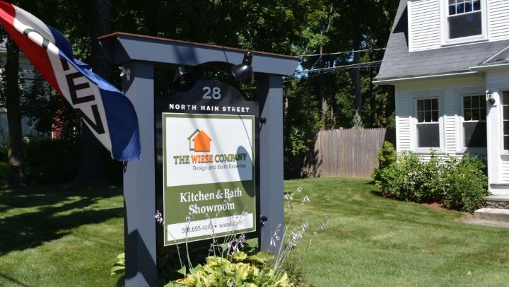
From our building to our logo, you will be seeing some changes to our presence on Main Street in Sherborn, our website and the yard signs in your neighborhood. This time around we decided to go a bit further with re-branding, so we did what our clients do… called in the experts. The unveiling of our new look will start with a new logo (coming soon) and then we will begin the process of our new website and signage which we have long felt is overdue.
Our first logo was a piece of clip art from some paint program, and our first office was Ray’s kitchen table in 1992. Since 2007, we have called the house on North Main St. home after a couple of improved home offices, a stint on Route 9 and an industrial park in Natick. And we updated our logo a few times post “clip art budget”:
The Creative Process: We had to find the right expertise to help rediscover our brand through the next decade and then some. We shopped around, asked for references and found our match after a meeting with some folks who shared our enthusiasm and whom really wanted to help us with this new “us”.
Our Message: Our goals for the new website were to tell the story of who our clients are and excite and inspire our visitors. We also will articulate what it is that makes The Wiese Company stand out in a congested, sometimes misunderstood design/build world that may be seen as cliché. When the new site launches we will lessen the language and highlight the projects we have created in collaboration with our clients. We will better describe what is behind our process that makes working with approachable and quality driven.
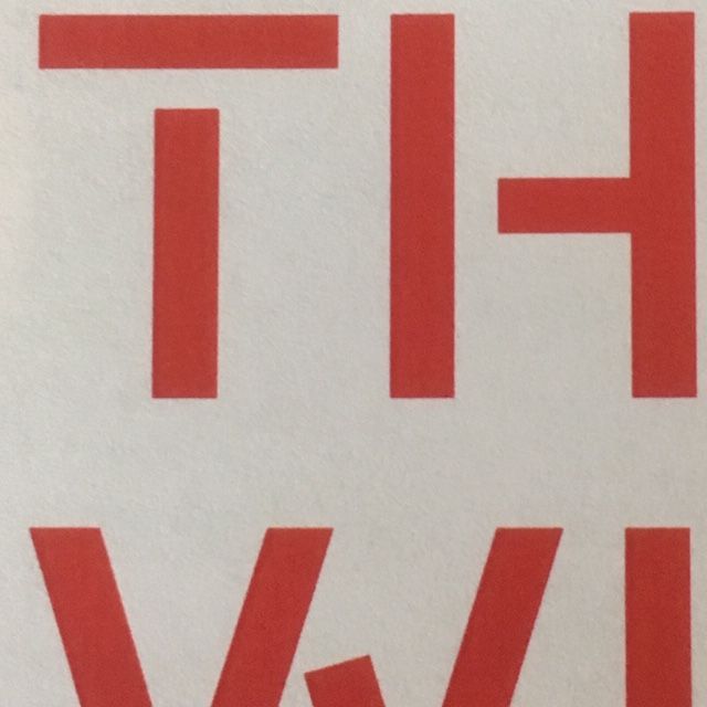
Our Visual Design: It was really interesting to see how much weight a good logo mark could have on telling the story of our company. Each mark’s distinct look came with its own narrative of how it was built and what it could convey. After weighing each one, we were able to unanimously choose one that told the his(story) of our journey through its own handcrafted typography and bold colors tocompliment the new look.
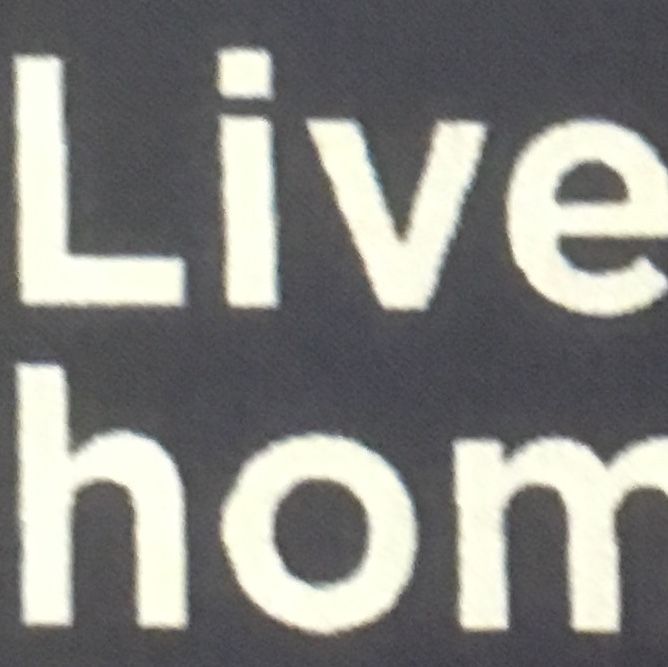
The redesign is still a work in progress, but we wanted to share some of the process with our extended family before we went live with our new look in the coming months. Stay tuned.

Comments
Leave a comment